Redesigning the website
Yes, I changed the design of this website again. But it was worth it! This'll be the last time for a while too (I think). The first time I redid the website was a month ago. But that was a complete overhaul, not just a visual redesign, like this one. I'm still using 11ty and GitHub Pages for this site. My goal is to not become a blog redesign addict, so I will try my very best to hold off on changing anything major for a while. Anyway, in this post, I'm going to talk about the new look!
Changes
For the record, here's what the blog looked like before:
As you can probably tell, there's a lot that's different, so to make things a little bit easier, I'm going to go over them in order from most obvious to least obvious.
I'll start with the colors. I didn't really like the goldish-brown color scheme of the old look, so that was one of the first things that I changed. The black and white color has been really nice because I can focus more on contrast, spacing, and font, instead of worrying about the many intricacies of colors. In my opinion, the monochrome design looks a lot cleaner!
The next thing I'll talk about is the font. I'm not a typography expert, but I personally like serif fonts much more than sans-serif. I think they're much easier to read, and they fit the "blog style" a lot better. The previous font was called Ubuntu. Now, I'm using Frank Ruhl Libre. Even though I prefer the serif font visually, finding the perfect fallback font for Frank Ruhl Libre was very difficult. My CLS scores were abysmal when I switched, and it took me a long time to find the perfect settings. I ended up using a modification of the Georgia font. The exact font family modifications were generated with capsize and are available in the source code of this website.
I also changed the layout, but this was by far the most subtle modification. Instead of being centered, the main elements now have a slight preference to the left. I thought it made the blog posts just a little bit easier to read.
Wrap-Up
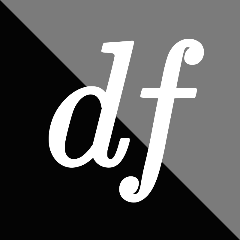
So that's what I've changed! I also made a fancy new logo based on the initials of my name, but I think that's less relevant not very relevant to the site design itself. I'll conclude this post by saying that website design is difficult, and sometimes more frustrating than the systems programming that I usually do. Honestly, I've found any sort of visual art in general quite hard; it seems like the more that I stare at something I've created, the less helpful my critique is. It's honestly helpful to take a break for a day and look at it with fresh eyes the next morning.
If you had any issues or suggestions for the post, feel free to submit an issue on this website's GitHub repository!